NATURE VS PLASTIC
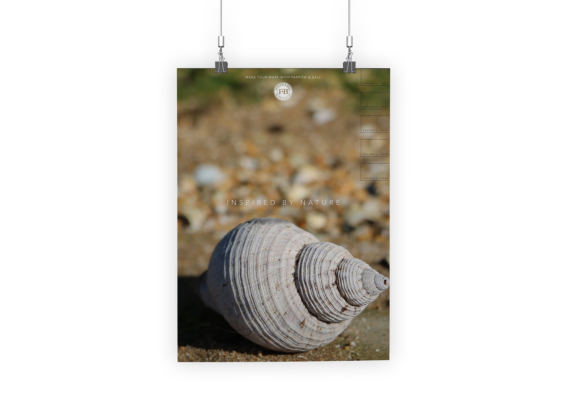
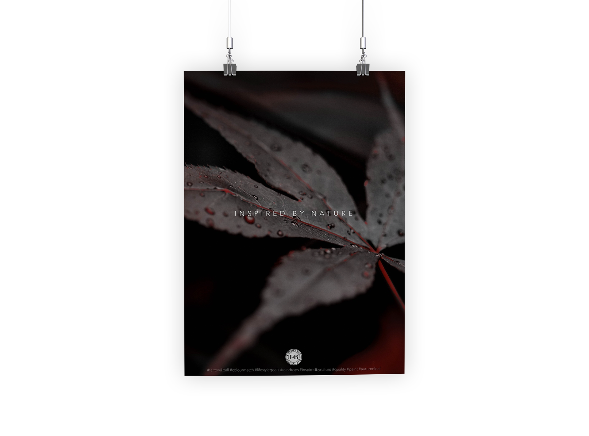
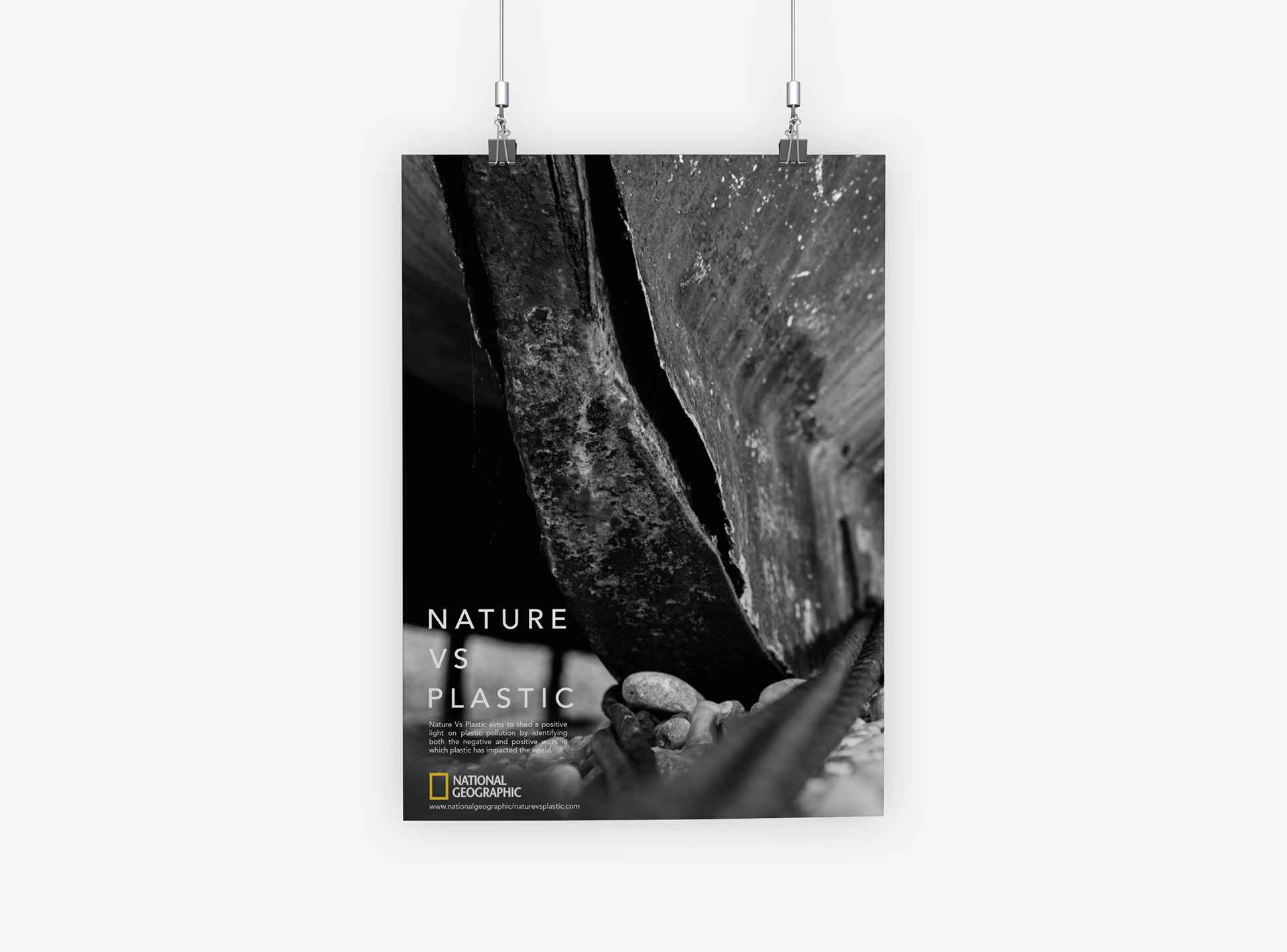
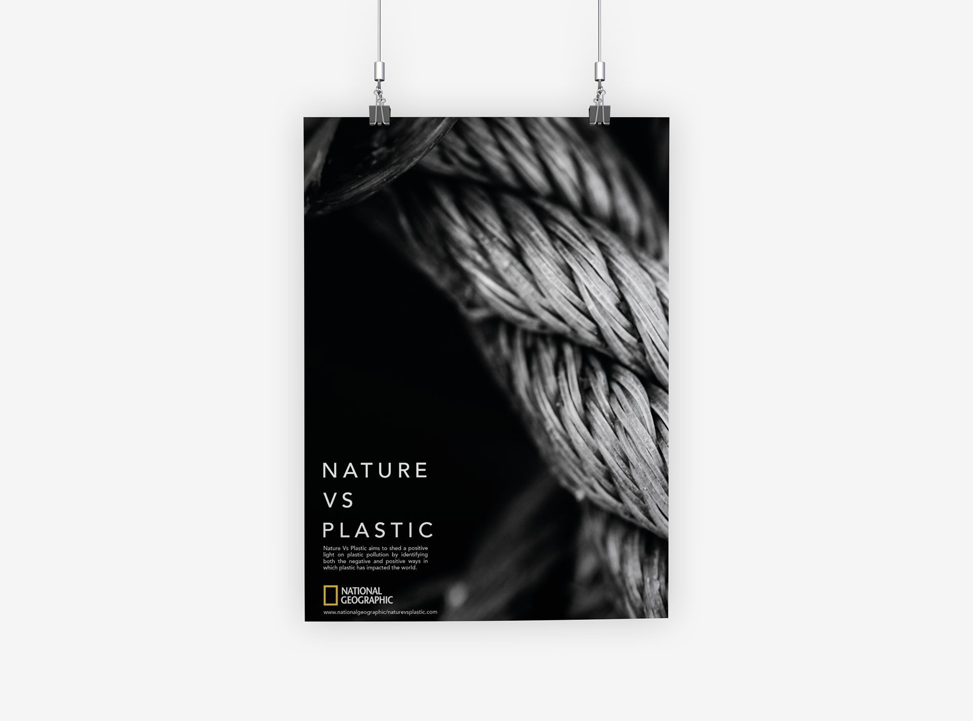
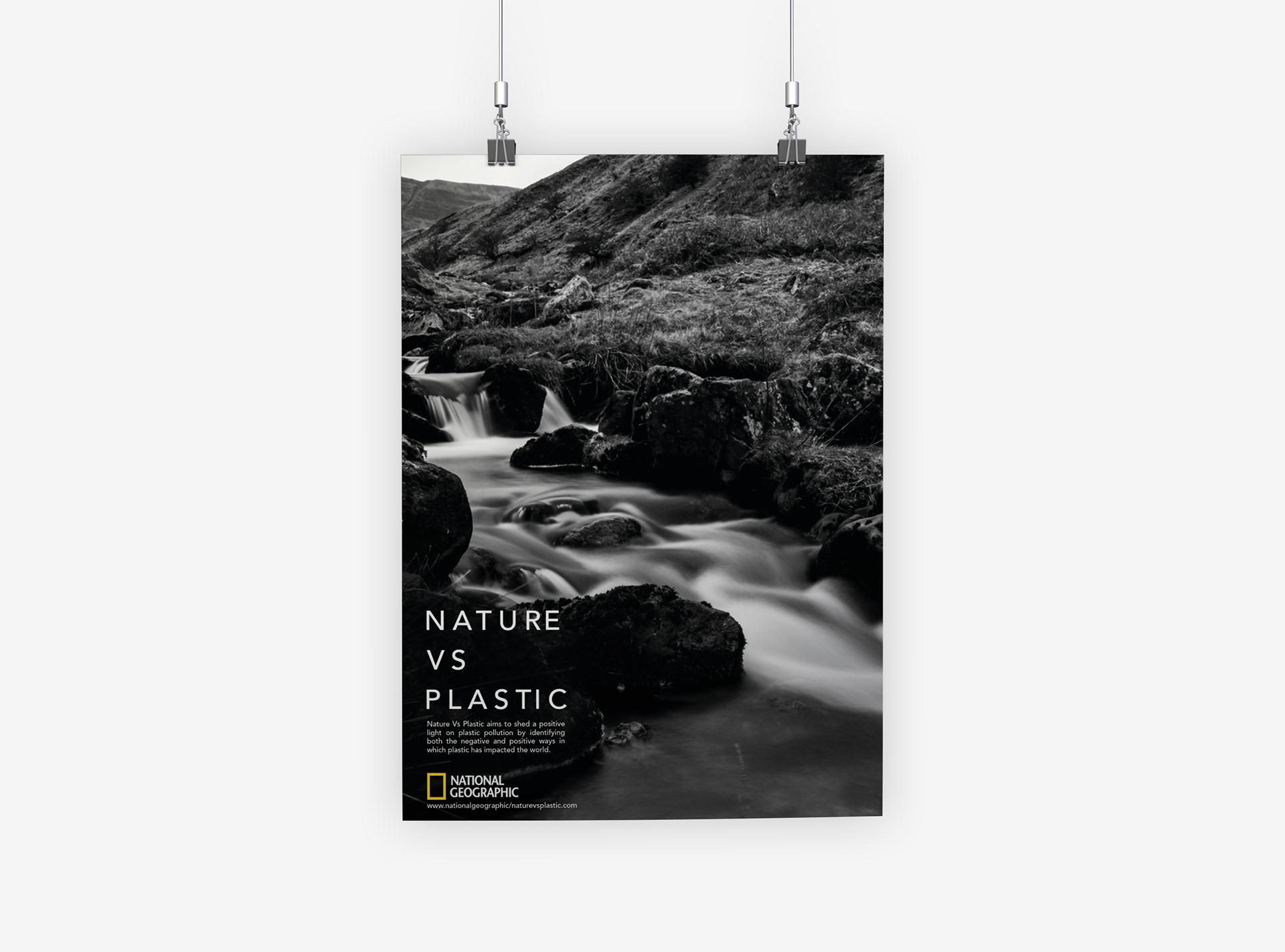
In Nature vs Plastic, I have captured and designed photographic prints showcasing the natural beauty of various locations across the UK, which are tarnished by plastic pollution. These images, edited in Lightroom, serve to highlight the contrast between the pristine environment and the pervasive issue of plastic waste.
The prints are used as promotional materials for the "Nature vs Plastic" book, which I designed to raise awareness and inspire action against plastic pollution. This project, initially inspired by a university brief, has evolved into a passion project.
WES ANDERSON
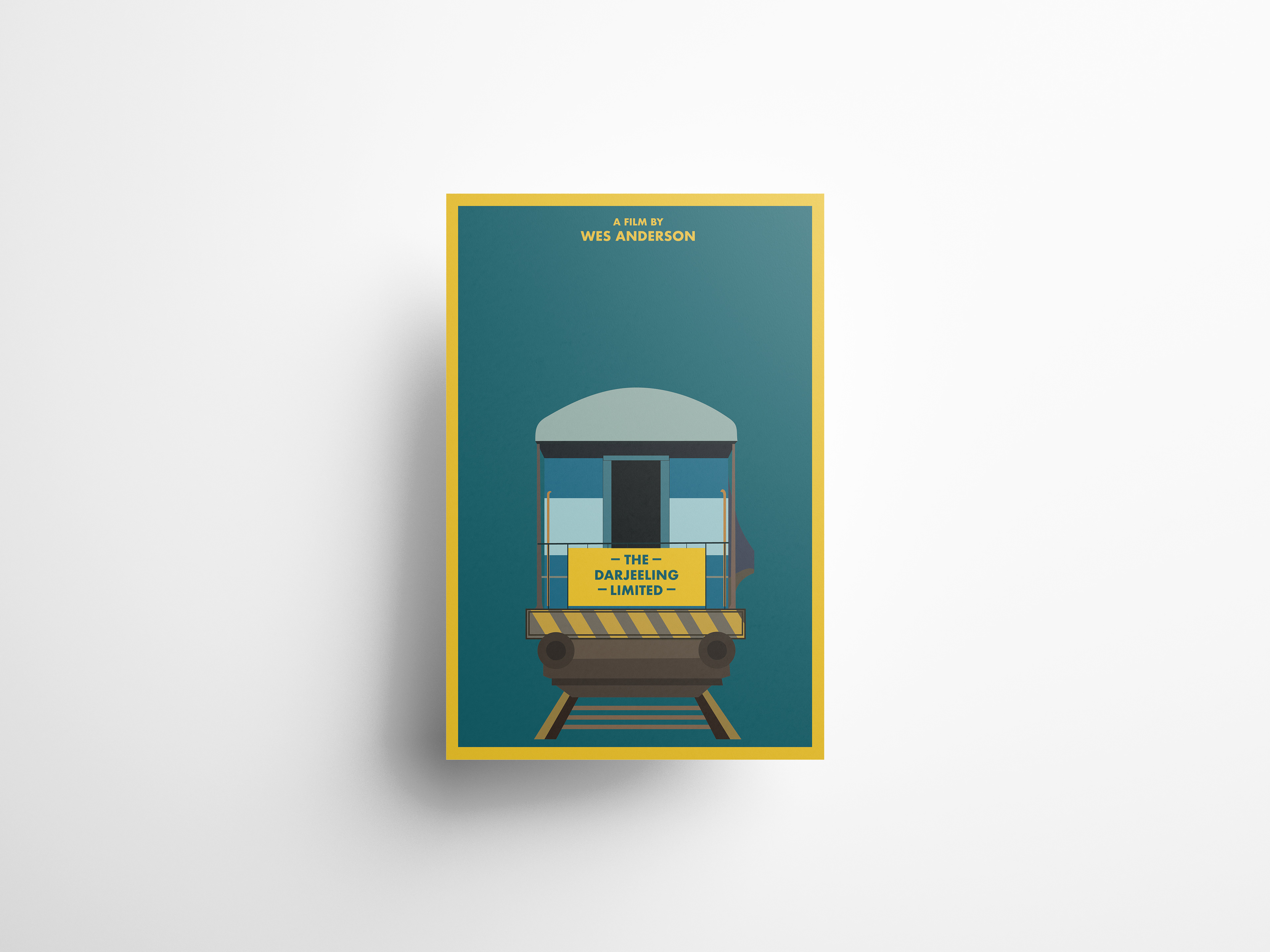
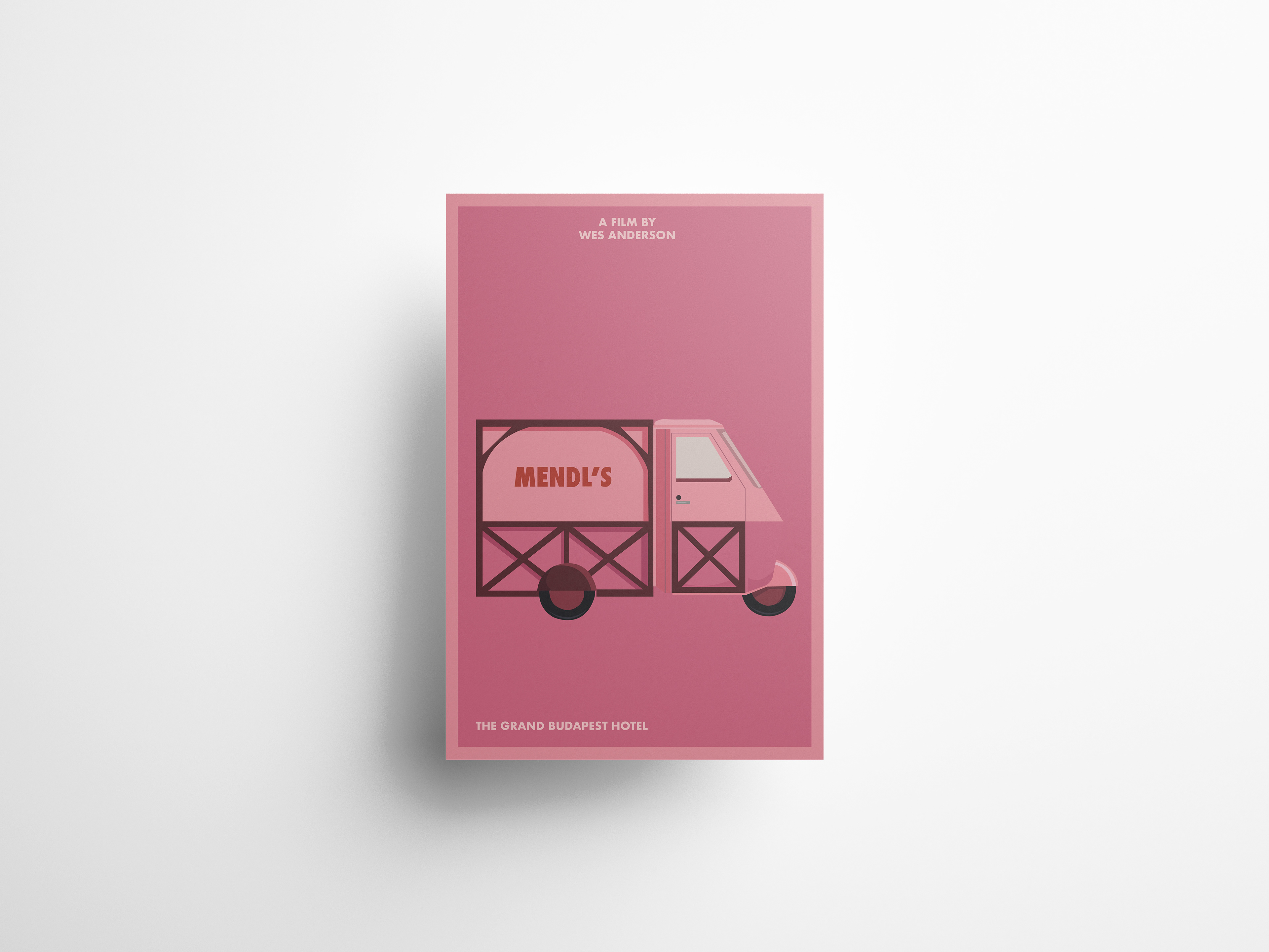
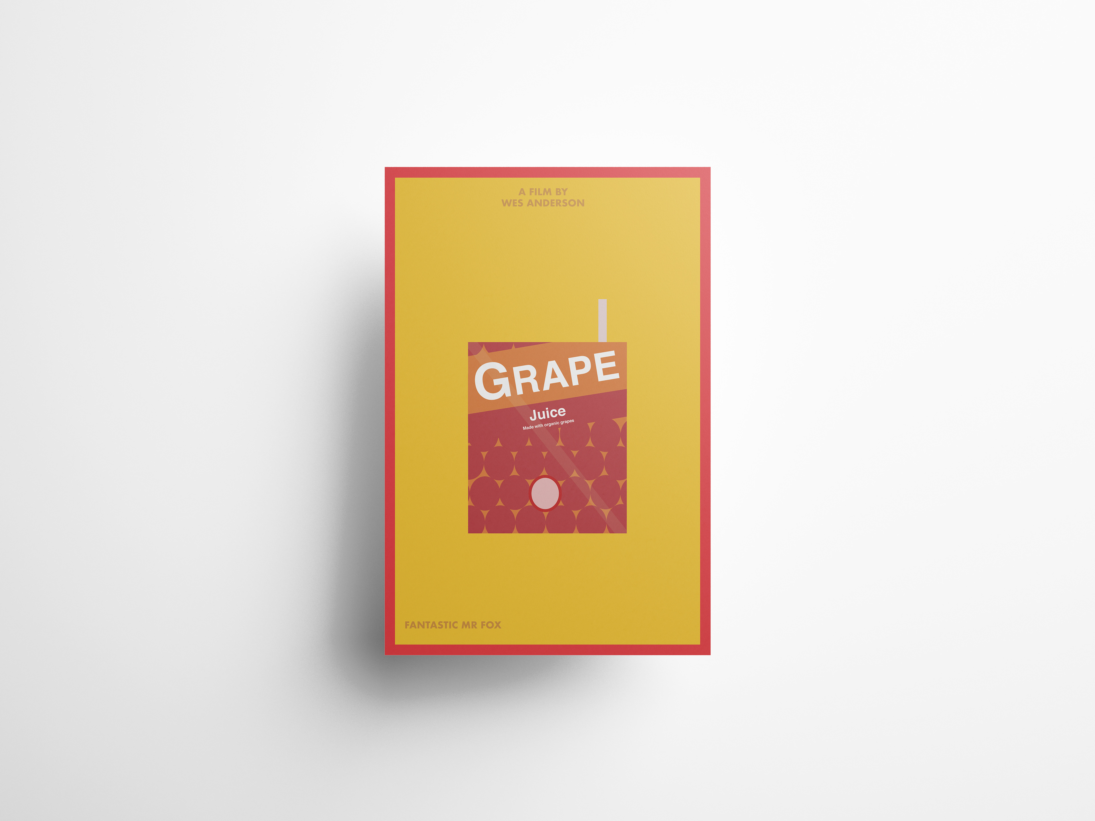
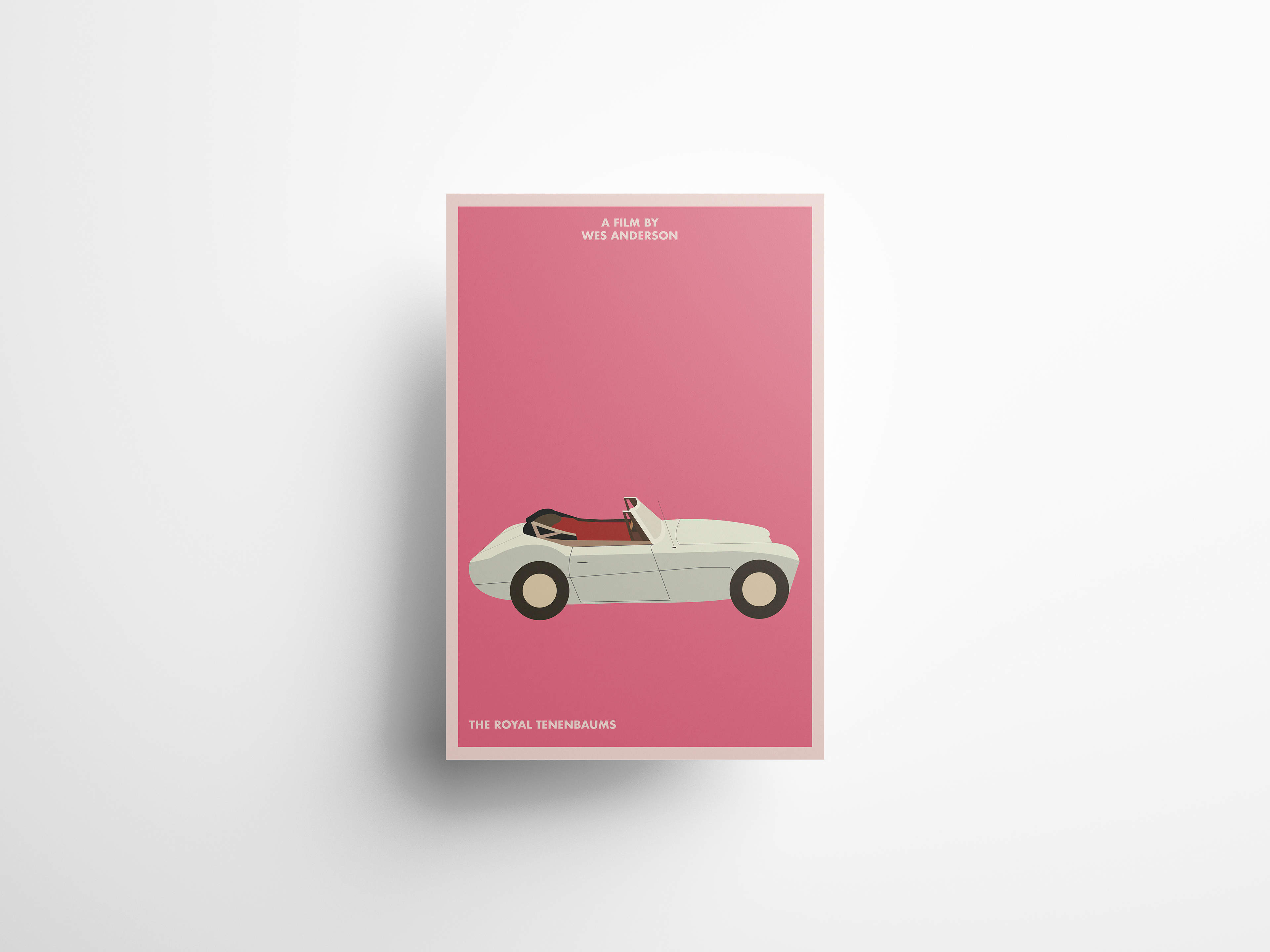
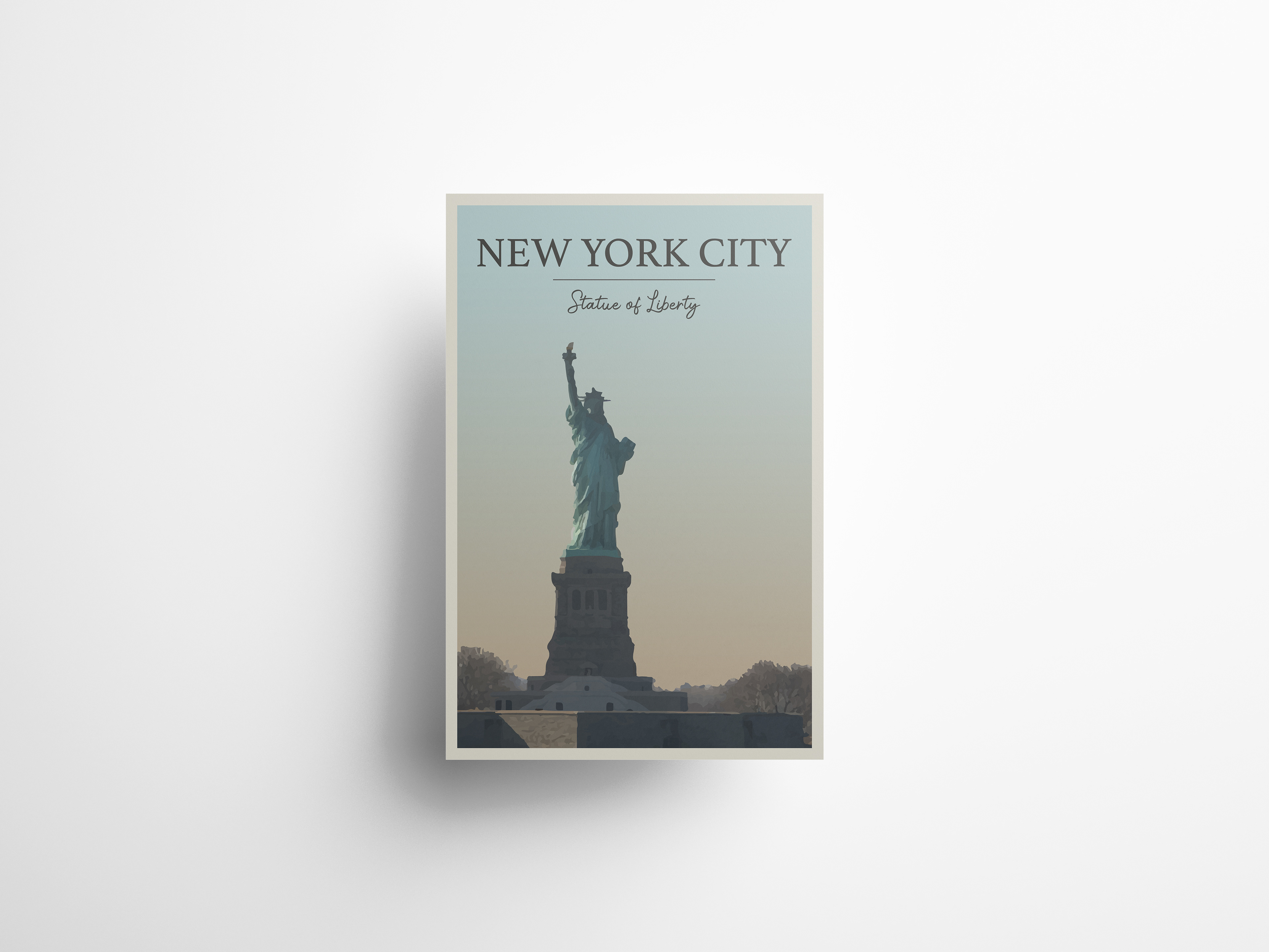
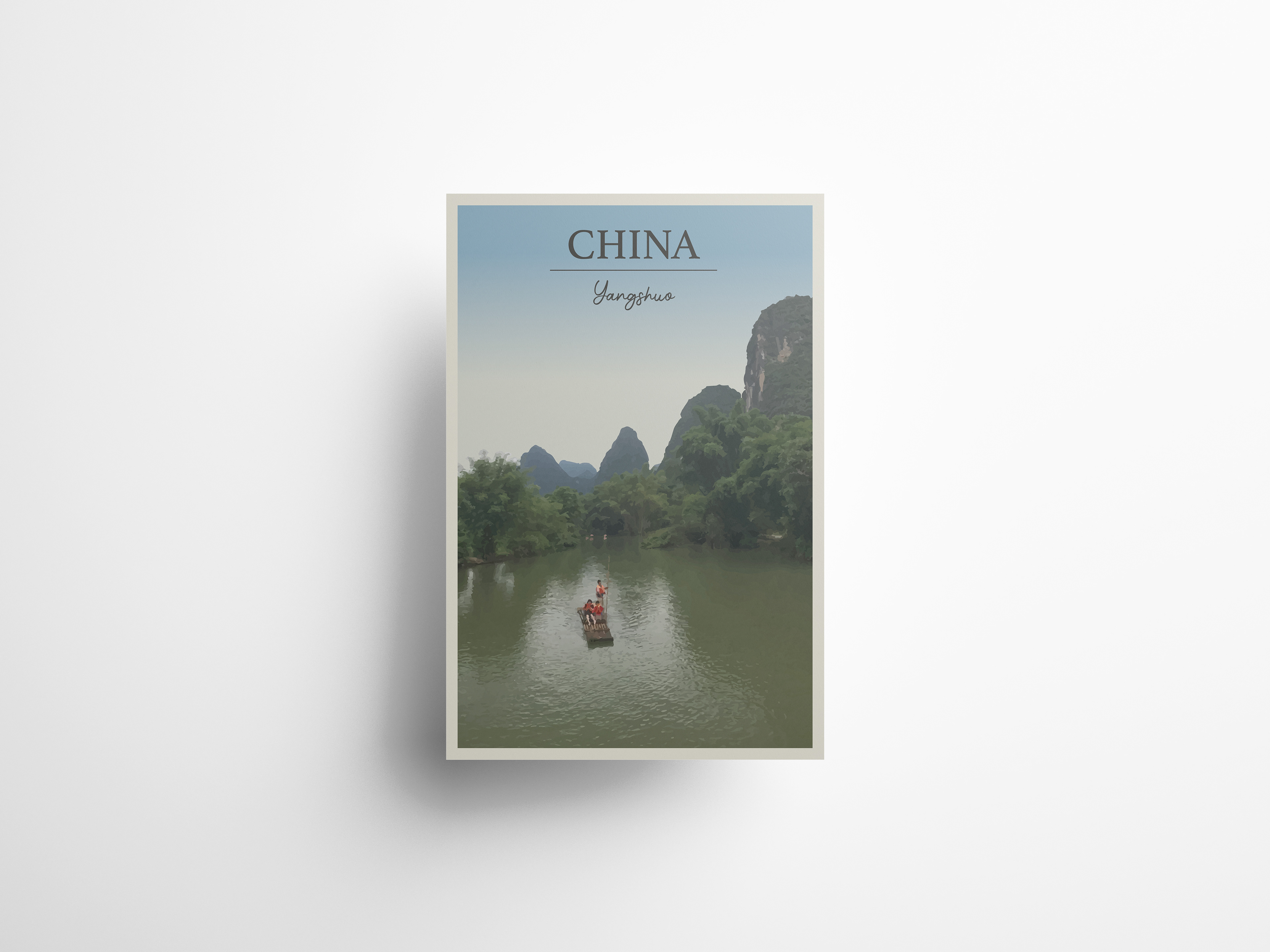
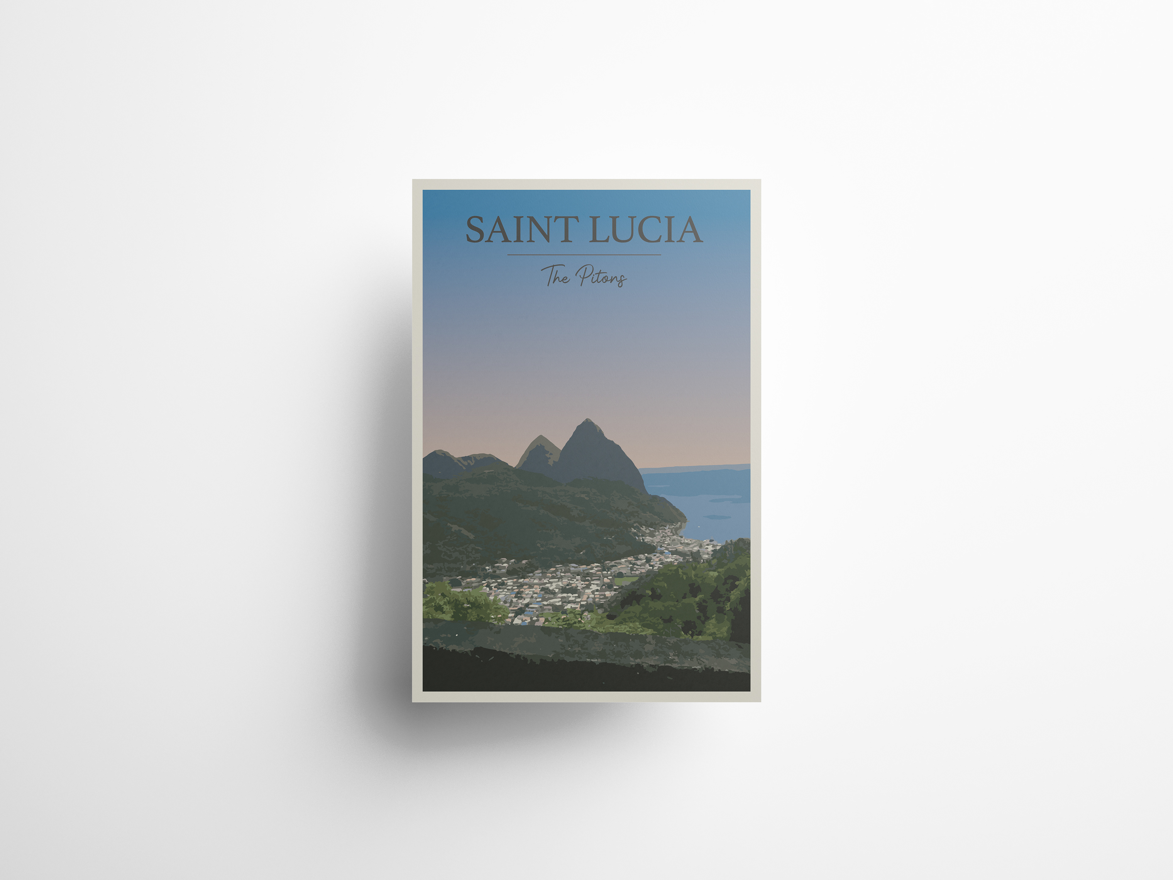
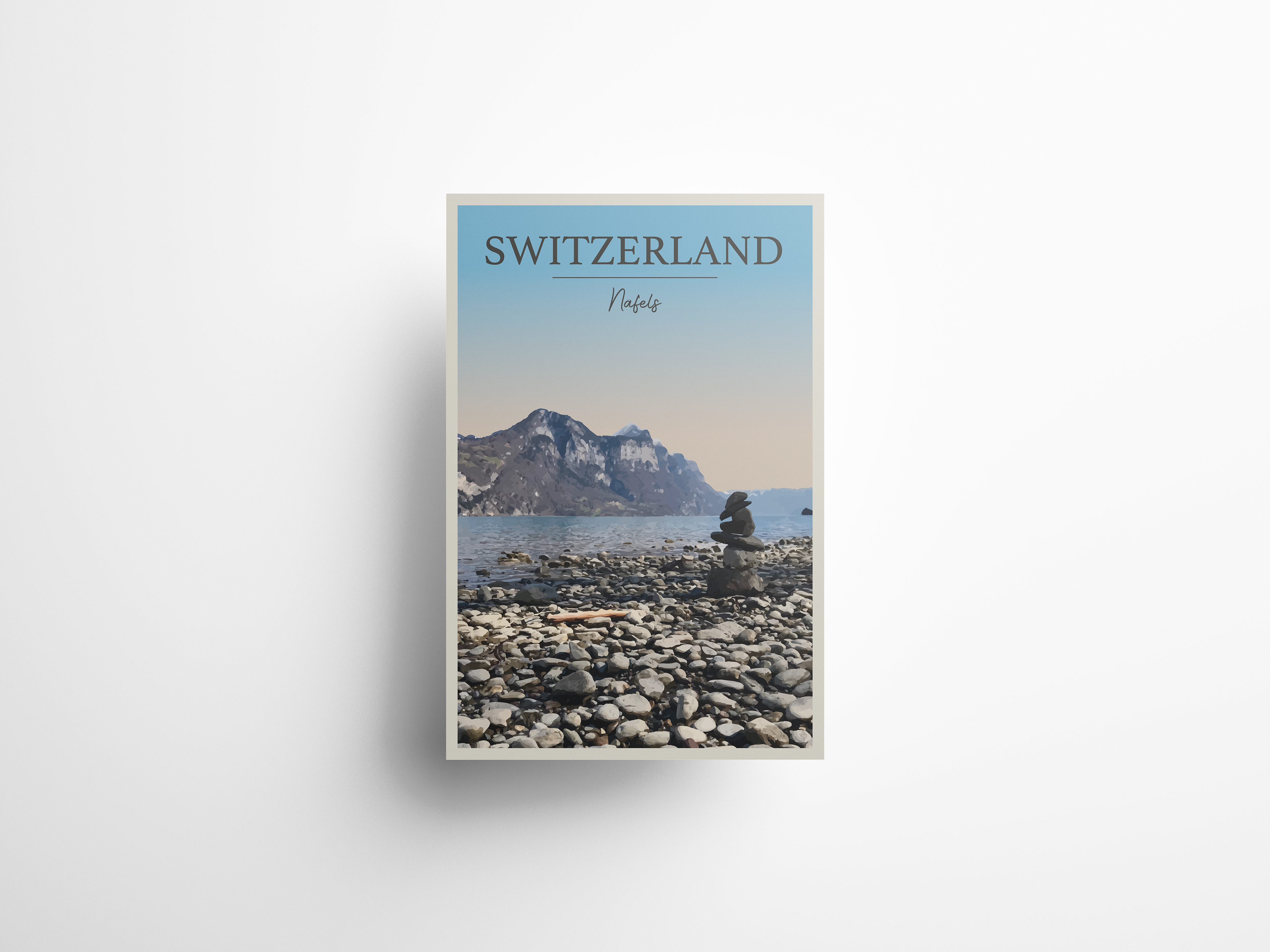
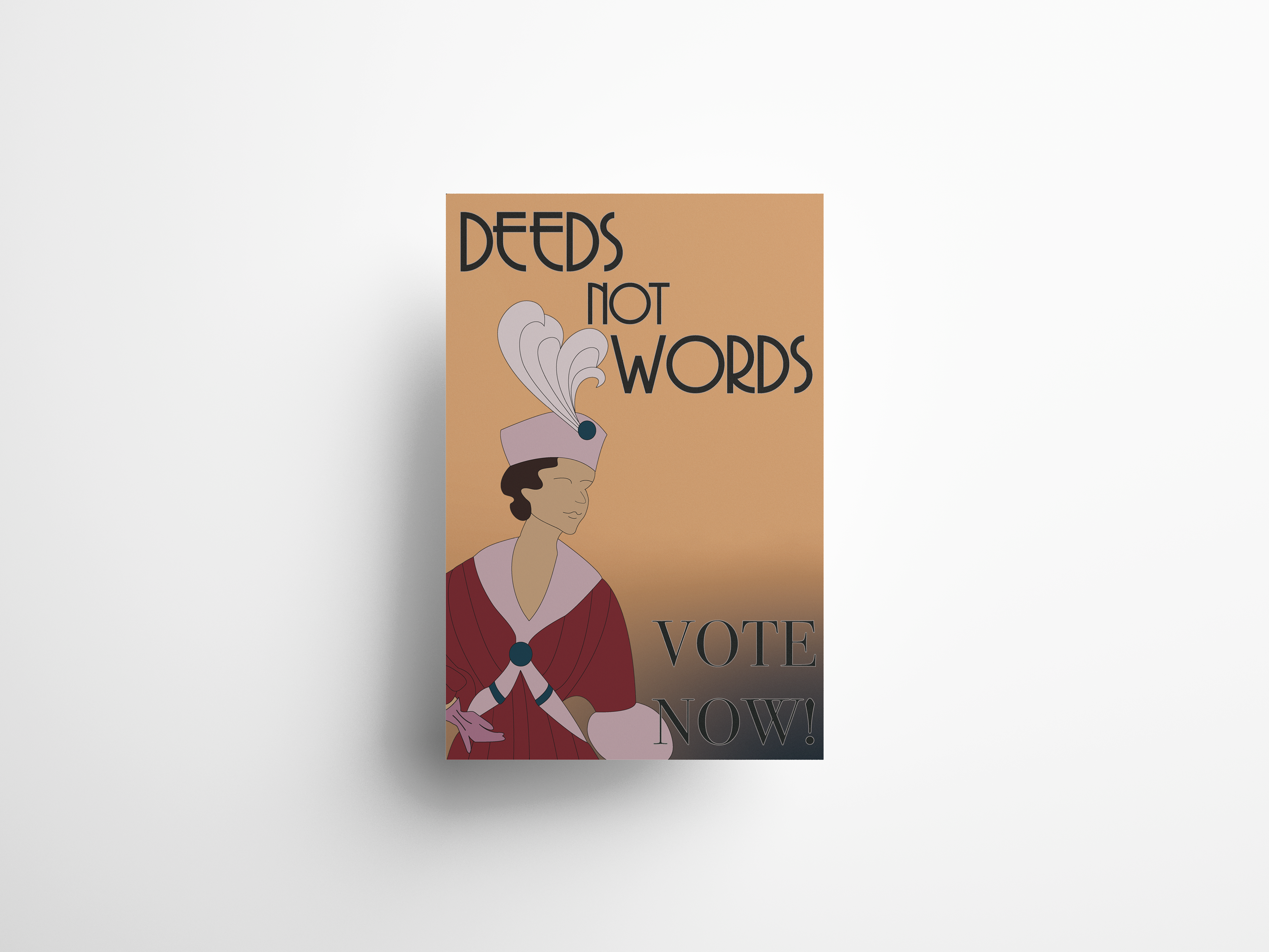
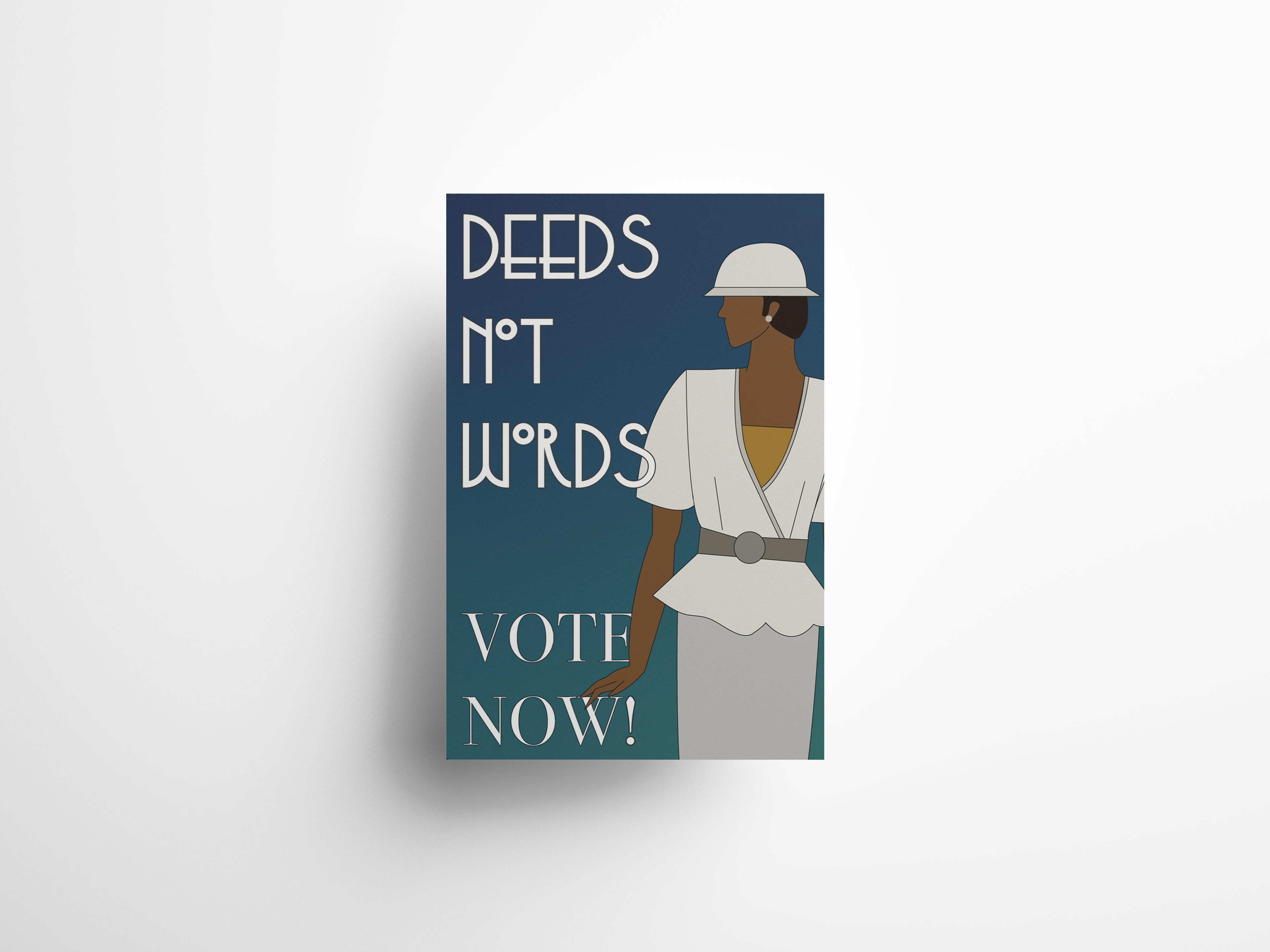
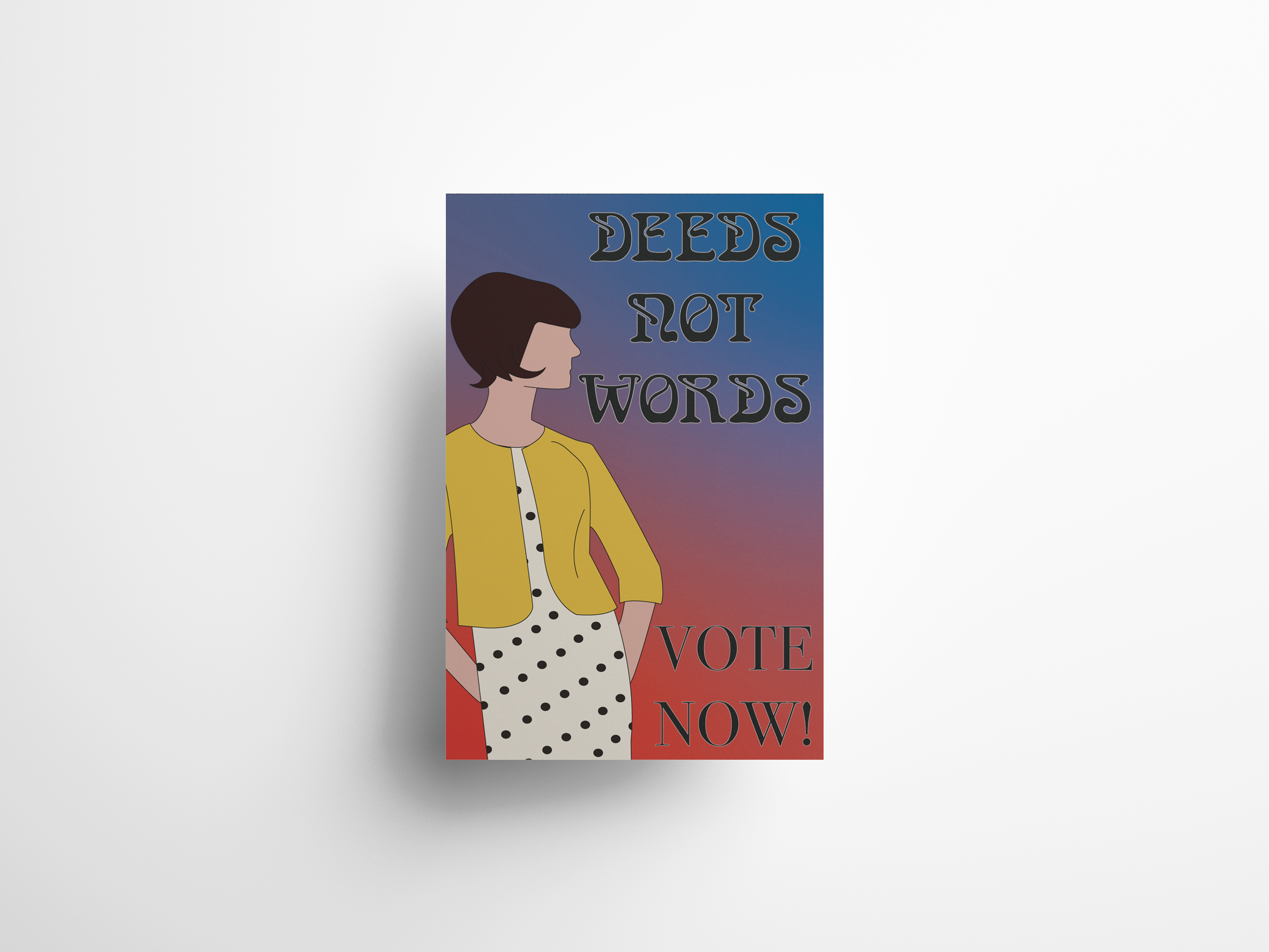
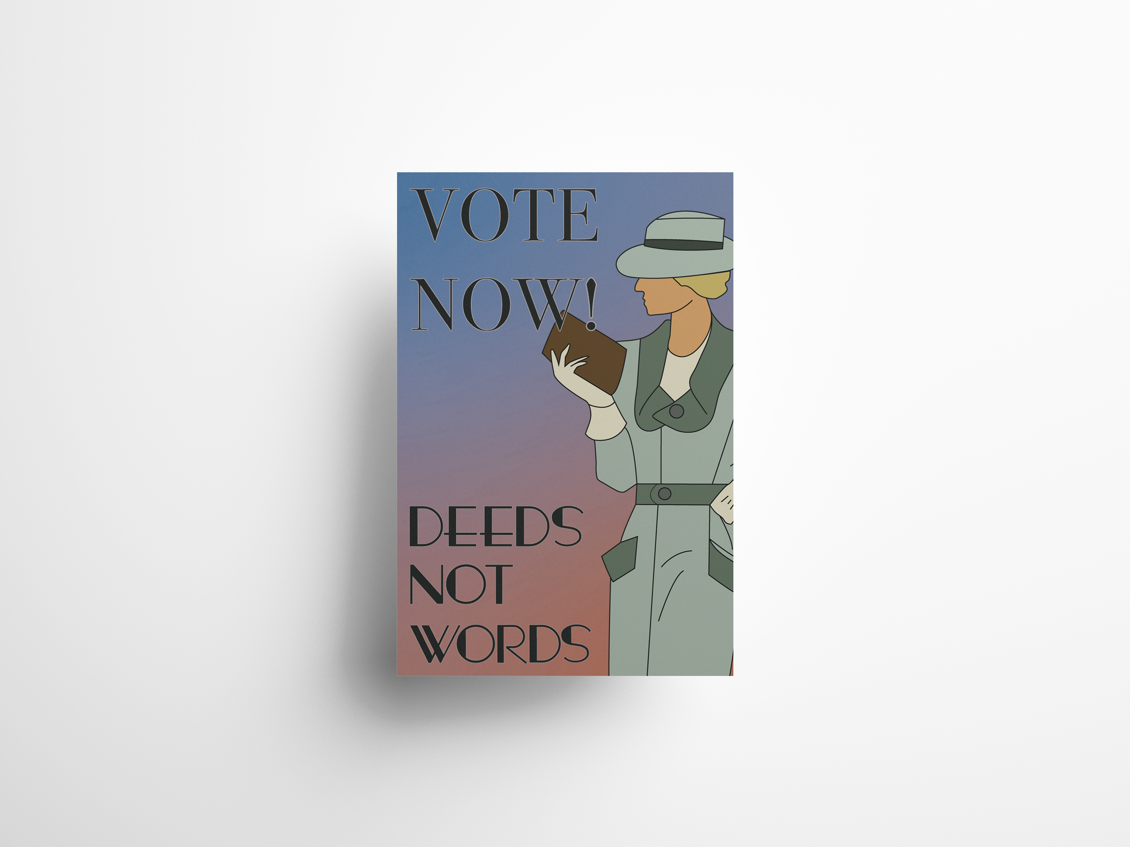
Digital illustration is an area I am keen to explore further and enhance my skills in. This particular project was an enjoyable endeavour, as it involved studying and emulating the distinctive and quirky style of Wes Anderson.
Wes Anderson's films are notable for their meticulous use of colour. Typically, his films revolve around a central colour, which recurs in various elements such as objects, clothing, vehicles, and interior décor. Predominantly, Anderson's films feature a palette of pale pink and turquoise. The use of colour in film is crucial, as it sets the tone for the characters and the time and place depicted.
In this project, I applied these principles to create three minimalistic posters, demonstrating my understanding of colour theory, typography, and Adobe Creative Cloud tools.
